1. In what ways does your media product use, develop or challenge forms and conventions of real media products?
Our music video uses a number of different forms and conventions of real media products. An example of this would be the use of lip syncing in our video. Nearly all music videos include the use of lip syncing so to use the same forms and conventions of real media products we have used lip syncing in ours, however, our lip syncing does not happen all of the way through our video, we have a reoccurring shot of the main character sat in a room on his own singing and watching flashbacks from his previous relationship. You often see more lip syncing than this in real media products but we felt our music video needed to be more about the story behind the music rather than the lip syncing.

In our music video we have used a combination of a black and white effect on some shots and a glow effect on other shots. We have used these two different effects to allow the audience to distinguish the difference between the present time shots and the flashbacks/memories. A black and white effect is usually used to show memories or flashbacks in real media products and a coloured shot used to show present time shots. However, we decided to use the effects the other way round, we used a black and white effect on our present time clips to show the unhappiness and the dull mood in the main characters life at the time, then we used the coloured shots for the flashbacks to signify that the memories he has of his ex-girlfriend where at happy times in his life.


This challenges the conventions of real media videos, for example in 'Timberland ft Nelly Furtado and Justin Timberlake- Give it to me' they use a black and white effect for their flashbacks of rehearsing for a show, then a colour effect for the present time clips in the video. This is the opposite to how we have used the effects.


Most music videos follow the same narrative structure, the stories move through the stages: exposition (where the viewer is introduced to the characters and the setting), development (where the storyline is developed and we are introduced to more characters), complication (a complicated event which will affect the lives of the main characters), climax (where the dramatic tension is at its highest) and resolution (where stability is re-established). We decided to not fully follow this narrative structure in our music video, we start to follow the structure but our video does not have a resolution stage. The final lyrics of the song are 'when will I be loved', this signifies that the character still has not managed to find love by the end of the song so there has not been a resolution. For this reason we do not have a resolution stage to the narrative structure of our video, it is left on a cliffhanger.

This is the ending of our video, ending with the main character walking off into the distance with nothing being resolved. This leaves the audience on a cliff hanger, wondering what is going to happen next. As there is no resolution, it is not sticking to the usual narrative structure of a music video.
2. How effective is the combination of your main product and your ancillary task?
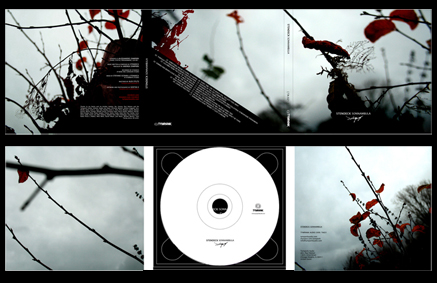
As the main product that we created is a music video, we made the decision to create a digipak cover and a poster for our ancillary task. The ancillary tasks combine with our final product well because the poster is designed to promote the music in the digipak. They run with a common theme of a black and white effect on a lonely picture of the main character ensuring the image used is memorable and instantly recognisable to the desired market, this common theme acts as a type of branding, we have created a brand of products using the same black and white theme on a lonely picture of our main character. The digipak and the poster are both based on the song and the artist used in our music video. All three combine to help promote the music of the particular artist we decided to use. The variety of media used in our different products are good for advertising and they help to reach a wider audience. The video can be placed online on websites such as YouTube, Facebook, Myspace and also on the TV on music channels. The advertising poster could be placed inside music magazines such as NME magazine or Q magazine to reach a particular audience, inside newspapers to reach a mass audience, or outside music venues or music shops for extra advertisement. The digipak is the product that would be bought by the audience.
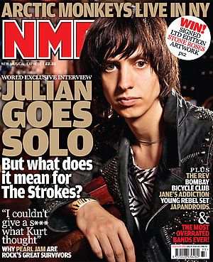

Screen shots of Q magazine and NME magazine front page. Target audiences of each magazine are people with indie/alternative rock interests anywhere between students and 40 years of age. This corresponds with the target audience we identified from our questionnaire for our music video, therefore these are perfect magazines to place our poster in to reach our target audience.


Double page spreads in the magazines follow a format of one large picture, with most of the focus of the picture on one half of the double page spread with the writing on the other half. We have also followed this format for our poster.
During the music video we thought it was important to reflect the loneliness in the lyrics with visual effects in the video. We thought it was also important to continue this theme on through our ancillary task. We have used similar pictures on the front cover of the digipak


Similar pictures in black and white used for front cover of digipak and poster.
3. What have you learnt from your audience feedback?
We first received feedback on our rough cut of our music video through posting it on both YouTube and on Facebook in order to know what we needed to change for our final product. We also received feedback on our final product to identify what the audience felt about our final product, things we managed to do well and also things we could have improved.
Posted on Facebook and on YouTube to receive feedback.
One main thing the feedback we received from our rough cut is that we needed to make the syncing a lot tighter and neater, there were a few shots in the video where the syncing was a bit out of time and it does not make the clip look very professional. We took this bit of feedback and when editing for the final cut we spent a long time making sure that the syncing throughout the video was crisp and perfect. Another bit of feedback we received from our rough cut is that it was hard for the audience to follow the storyline, they did not feel that it was clear enough and the concept of the video does not show through very well. For our final cut we went out and filmed some new shots so that we had shots at the same locations for flashbacks and present time. This made the audience able to see the contrast between the present time footage and the memories which helps the audience follow the story line and see the concept better. One more piece of feedback we received is the camera shake on some shots. The camera shake on shots where it was not intended makes the video look unprofessional. To improve on this when creating our final music video we re-filmed some of the shots using a tripod so that the camera was steady and there was no unwanted shake caused by the hand. We also used the 'stabilisation' button when editing on clips where there was still unwanted shake, this stabilised the clip so that there was no shake at all.
One piece of feedback that we received after our final cut is that the lip syncing could have been better quality in some of the shots due to the acting which was not perfect and it would have looked better if the character would have felt the music more and made it look like it was actually being sung at the time in selected shots. Looking back on the footage now we also see that if there was more effort being put into some of the lip syncing shots it could have looked slightly better to the audience but we still think these shots do look good, just not perfect. Another piece of feedback we received is that some of the shots lasted too long. It is a slow song so there isn't supposed to be quick cuts between shots but it was felt that there were some shots that just lasted a couple of seconds too long. Looking back again we can also see that there are clips that last too long, we do not feel that it is a drastic thing that ruins the whole video but we agree that if we did shorten these clips it would be slightly more captivating and may improve the video on the whole.
4. How did you use new media technologies in the construction and research, planning and evaluation stages?
Throughout our portfolio we posted all of our work onto blogger to record our planning and research and evaluation stages all in one place. This meant that we could view our work on any computer and it reduced the risk of losing any work and keeps well presented.
In the research stage of our media product we had to find a song that we would use to create our video for. For this we used the website www.unsigned.com, this allowed us to search specific genres and listen to songs from thousands of unsigned artists and contact them to use some music. We then had to view as many different music videos as possible to see all sorts of different styles of video from all different genres and mainly focus on our genre to see if there are any main characteristics we need to include when making our video. Our main source to find and view music videos was YouTube. This allowed us to view any music video we wanted on demand. We could also pause the video and replay it to allow us to analyse it properly and take notes.
In the planning stage we used our smartphones a lot to share all sorts of ideas with each other. If anybody happened to see a location that they thought could have been a possible filming location they would take a picture and send it to the rest of the members of the group who could then give their opinions on the location. The photo could then be uploaded onto a computer and put onto our blog. We would also use our smartphones if we had any other ideas about our music video. This allowed us to contact every other member of the group to discuss it wherever we were. I feel that the use of our smartphones were very handy. We also used e-mail and text on smart phones to allow us to organise filming times and editing times to keep us efficient keeping to our tight time schedule.
When constructing our music video we used a number of different new media technologies which helped us create a good final product. Firstly we used a HD camera so that the quality of the video is the best that it could be. We used a Tripod to stand the camera on while filming to limit unintentional camera shake from the hand. We also used iMovie editing software which allowed us to put the effects on the clips that we wanted, the sharpness with the lip syncing, the transition effects, the stabilisation on the shots and the smooth cuts.
When constructing our digipak we used Microsoft Publisher to create each panel. We could use CD cover templates so that we had the exact measurements. Publisher also allowed us to add the black and white effect onto our product. For our poster we used Microsoft Word because it allowed us to make simple changes in order to create a good looking and well presented final product.
In the evaluation stage we needed to find a way to get the video shown to many different people so that we could receive a wide range of feedback. We decided we would use the social network Facebook and video sharing site YouTube, this allowed us to contact as many people as possible and get our video seen by as many people as possible. This meant that we would be able to use all of the feedback we had received in the evaluation process of our media product.