After reviewing our rough digipak and receiving feedback we felt that there is nothing that we wish to change in our front cover, deep red song title we felt isn't too over the top but is still eye-catching. Also our chosen picture is very appropriate for the message we are trying to give.
We decided that the picture we chose for our rough version was very appropriate and we didn't want to change this, however the feedback that we received suggested that the lyrics are hard to read with the colour that we had chosen against the background. Due to this, we decided to change the colour of the lyrics to black which made it a lot clearer to read and looked a lot better on the eye.
We decided that the red CD page in our rough digipak didn't look very good and didn't match the rest of our digipak very well and this is also the feedback that we received on our digipak. To change it we decided to put it back to a black and white theme, this now looks a lot better and goes well with the rest of our digipak.
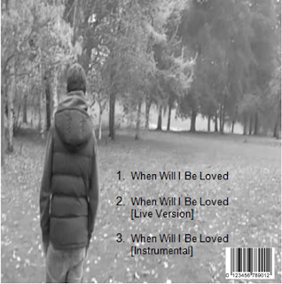
We realised that the back cover was very good, however lacked the detail you would find on a real digipak. We have now added a bar-code to the back to make it professional looking.
We realised that digipaks also have a spine to them with the name of the artist and the song name on so we created one of these. We chose to have a gray spine with clear black writing so that it looks clean cut and goes well with the rest of the digipak.


No comments:
Post a Comment