After receiving feedback and reviewing our rough poster we decided there were a few things that we would need to change about our poster to make a connection with the other products that we have produced. We decided to use a still image of me (the main character of our video) as I am in the video and also in 3 out of 4 of the panels for the digipak. We also used a black and white theme to help with the connection between the products and make it instantly recognisable. We felt that it was important to add in the website for Erick Baker too as another form of advertising. The black and white theme and the alone still shots that we use throughout all of our media products help act as branding for the artist.
Tuesday, 27 March 2012
Ancillary Poster Rough
We decided to use this picture of Erick Baker for our poster because the colours in the picture are quite striking and eye-catching to the audience which will help with the marketing of the poster. The big bold title is also eye-catching and helps the audience to see what the poster is about with a short glance. We have decided to include the song name and information about where it is available to download from and when. This to make the Poster look professional so that it would fit into a music magazine such as NME or Q magazine well.


Ancillary Digipak Final
After reviewing our rough digipak and receiving feedback we felt that there is nothing that we wish to change in our front cover, deep red song title we felt isn't too over the top but is still eye-catching. Also our chosen picture is very appropriate for the message we are trying to give.
We decided that the picture we chose for our rough version was very appropriate and we didn't want to change this, however the feedback that we received suggested that the lyrics are hard to read with the colour that we had chosen against the background. Due to this, we decided to change the colour of the lyrics to black which made it a lot clearer to read and looked a lot better on the eye.
We decided that the red CD page in our rough digipak didn't look very good and didn't match the rest of our digipak very well and this is also the feedback that we received on our digipak. To change it we decided to put it back to a black and white theme, this now looks a lot better and goes well with the rest of our digipak.
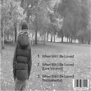
We realised that the back cover was very good, however lacked the detail you would find on a real digipak. We have now added a bar-code to the back to make it professional looking.
We realised that digipaks also have a spine to them with the name of the artist and the song name on so we created one of these. We chose to have a gray spine with clear black writing so that it looks clean cut and goes well with the rest of the digipak.
Ancillary Digipak Rough
We decided to use the same black and white theme through this digipak to add to the branding of our product and to help connect our products together. We used stills of the main character to help connect our products together and also to help with the branding of the products.
We have used a still image of me (the main character of our video) for the front cover alone with a reflective look on his face. We decided to use this picture because we feel it describes the song title well and is a very appropriate image to use for the front cover. It reflects the lyrics of the song and the mood that we brought out in our video as well. We felt that the deep red colour for the song title helped to show the autumn feel about the song and it also helps give a striking look to the front cover to catch the audiences attention.
For the lyrics page we decided to use a similar picture to the one of the front cover with a similar expression of the character. We included a large brick wall to use as a background for the lyrics to sit on. We decided to use a black and white picture with red writing to add to the continuity of our task.
For the CD page we decided to use a tranquil picture of some tree branches because it carries on the autumn theme nicely along with the red colouring to the picture.
For the back cover we used yet another still image of me with a black and white theme to it. I am looking in the opposite direction to the camera to give the audience an idea about the feelings of the character in the video, having to turn his back on what he used to have.
Subscribe to:
Comments (Atom)


